Honouring the Female Creatives Behind the Royal Mail
- julieemmataylor
- 7 days ago
- 12 min read

This week I stumbled upon an article on the Post Office Museum website and a list of women influential in the design for the (GPO) General Postal Office or as we call it today the Royal Mail. All the women on the list where born in the 1800 and 1900.
Born in the era of the suffragettes, these women witnessed firsthand a transformative movement—one that must have deeply inspired them, urging them to find their voice, challenge conventions, and boldly shape their creative paths. Some of them I had heard of but some not at all. It has been so moving to explore and learn there stories.
These women opened doors and paved paths, breaking barriers in an era that rarely celebrated or acknowledged female creativity.
I just wanted to honour these women and celebrate their stories, it's not a small blog but so much beautiful work just waiting to be discovered and admired.
Enid Marx
(1902-1998)
Enid Marx, played a pivotal role in the early 1950s in the design of British stamps and is seen as one of the first female designer to create a stamp for the Royal Mail. In 1952, she was commissioned to design a set of commemorative stamps for the Coronation of Queen Elizabeth II.
Born in London in 1902. She studied at the Royal College of Art, though she would fail her diploma in 1925. She travelled with her family in Europe before the First World War, witnessing the avant-garde arts movements of the early 20th century.
Her other accomplishment where textile designs for the London Transport Board and the Utility furniture Scheme. Marx was the first female engraver to be designated as a Royal Designer for Industry.
The stamps used Dorothy Wilding photographic portrait of Queen Elizabeth II. Dorothy was the issued the first Royal Warrant for a female photographer in 1943. So it is amazing to see that those stamps were created with two such strong female influence, which only seems fit for Queen Elizabeth. These stamps with the iconic three-quarter profile, where the Queen’s head is turned slightly towards the viewer, would become known commonly as ‘Wildings’.
Enid initially submitted four designs with the Queen’s head circled with the English rose, Scottish thistle, Welsh daffodil and Northern Irish shamrock.
This initial design was given feedback of being too overcrowded and to make some changes by Lord Crawford, Chairman of the Royal Fine Arts Commission. However on looking at them her originals where much more beautiful and intricate and something in simplifying them only in my opinion a little charm was lost. Following her changes the design were then approved by the Queen and went on sale 5 December 1952.
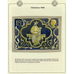
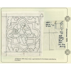
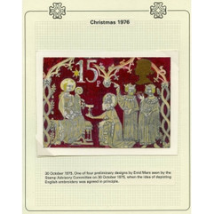
She also designed 1976 Christmas stamps. The four stamps depict 13th and 14th century medieval embroidery from the Victoria and Albert Museum collection. She also designed the products sold with the Christmas stamp. This included the First Day Cover, an envelope featuring the new stamps, and the Presentation Pack, which provided information behind the designs.
Marx also submitted other designs before and after this success that weren’t selected but I thought you might want to see them anyway.
Her work had a modernist approach, boldness, and elegance. Making it a pivotal moment in the recognition of women in the traditionally male-dominated field of stamp design changed views on female contribution.
Marjorie Saynor
1924-2012
She initially studied at the Royal College of Art in Hull later she was awarded a scholarship at the Royal College of Art. She produced stamps for Royal Mail during the 60s and 70s. She was commissioned for 5 stamp issues but submitted many more over her career.
Her first stamp was issued in 1970 for ‘International Co-operative Alliance 1895’ and the ‘Royal Astronomy Society 1820’.
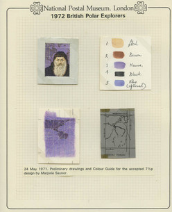
Her next stamps in 1972 were on the theme of key British Polar Explorers and in 1973 where created on explorers in warmer climates. The maps behind the explorers she took such attention to detail. She broke each element of the design into smaller design decisions, its wonderful to see her process and that it was recorded in such a detailed way. Things being accurate was important to her, it was said researched her designs and studied portraits at the National Portrait Gallery.
She also created a range of maritime heritage stamps, really considering the layout of all the key aspects. Each showing the naval figure portrait, their transport, value of the stamp and the queens silhouette. The detail in such a small space, is absolutely exquisite.
She submitted lots of work never used or published here are a few. It was common at that time for lots of artists and designers to be asked and only a few ever used. The collection of unused ones where called the ‘unadopted artwork’ collection. Here are a few of hers.
Lili Réthi
1894-1969
Born in Vienna, Austria. She left Germany to avoid a commission from Hermann Göring glorifying the Third Reich. She then settled in the London when she produced the posters for GPO and the London Railway. Later she moved to New York to illustrate the World’s Fair for the illustrated London news and applied for citizenship upon arrival. In her career she illustrated over 50 books. Her work can be seen at the London postal museum, the national gallery of art and the museum of the city of new york.
Vanessa Bell
1879-1961
Born in England. She was a painter and designer. She then studied painting at the Royal Academy in 1901. She was also the sister of the author Virginia Woolf. She was celebrated in the Bloomsbury group during her lifetime and exhibited in London and Paris. There was 10 core members of the group, her and her sisters the only original females.
The artwork for a General Post Office poster ‘The Last Minute’ for which she received 50 guineas was rejected as not conveying: ‘the message which the Post Office wishes to convey on the subject of Early Posting’.

I think it’s a beautiful little snapshot of people busily posting letter and it capturing that moment beautifully but alike any brief sometimes it’s back to the drawing board or another idea is gone with. It’s nice its still documented though as many rejected ideas usually just disappear in time.
Donia Nachshen
1903-1987
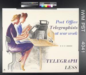
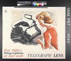
Born in Ukraine. Her family fled an anti-jewish program in the early 20th century before settling in London. She studied at the Slade School of Art and is best known for her World War Two posters including for the Post Office. They also focus on women at work, in the telegraph service rather than the Post Office counter. Such beautiful drawn illustrations which caught the time of fashion and female strength in a time of adversity. She was also famous for ‘the Make Do and Mend campaign’ During the war she also illustrated books for Fyodor Dostoyevsky and Enid Blyton.
Grace Golden
1904-1993
Born in England, Grace studied at City of London School for Girls and won a scholarship to the Chelsea College of Art and progressed then to the Royal College of Art. She later taught at the College from 1927-28. She was commisioned to illustrate historic building and landmarks, often painting in public during the war with a permit from the War Artists Advisory Committee. I can’t imagine what that must of been like. In her time with Ministry of Information her posters promoted safe working, highlight hazards of a mixed sex workforce within wartime with slogans such as "Keep your mind on the job – and save your knuckles’
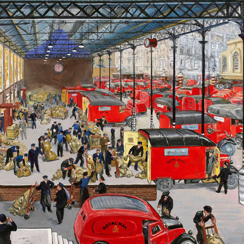
The posters she designed for the GPO was a series of posters in 1948 illustrating the work of post office workers at four locations in London. You can see the level of detail in her work but also the ability to capture a moment in time in such busy active places is not easy to achieve and in each one each time you look at it, you see something different.

Daphne Padden
1927-2009
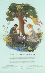
Born in may of 1927 in London. Her father was an artist Percy Padden. Educated at Epsom & Orwell School of Art, getting her National Diploma in design. In her career Daphne as a graphic designer produced work for travel and leisure in the post war boom. for a range of clients including P&O, British Transport Commission and General Post & Savings Bank, Marks and Spencers, Pall Mall Cigarettes. She also loved to paint in watercolour and gouache and exhibited her work. She loved to main in miniature.
Her work for the Royal Mail was modern, bold, colourful and eye-catching. I love her use of colour and playfulness she captures, its so inviting to look at with great composition. It shows the excitement of receiving and sending mail during a time of increasing international travel.
Gladys Rees
1898-1985
Gladys born in London, studying at Chelsea School of Art and later on taught at the school in later years. I struggled to find too much information about her. I know she was awarded a diploma in painting. She designed for London Underground, illustrated a number of books she wrote herself. A beautiful fact I did find out though, was her granddaughter wrote a dissertation on her.
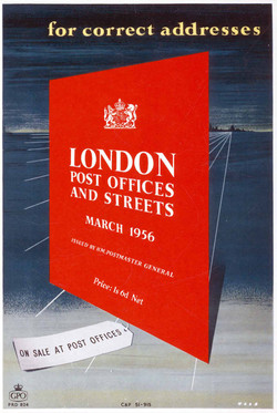
For the Post Office, she produced a poster advertising the London Post Offices and Streets guide. It’s a bold striking design that I am sure would not be missed posted anywhere.
Mildred Ratcliffe
1899-1988
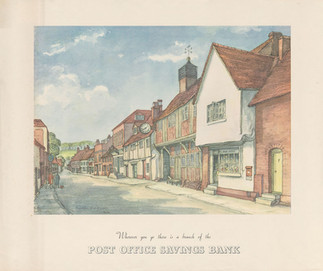
Mildred was born in Rochester, Kent. She was the second of seven children. Leaving school she was a wage clerk with civiil service then as a clerical officer at the Post Office Savings Bank. In the 1920s she moved her job role to publicity. There she designed posters and promotional material from 1930’s to the 1950’s
The posters she produced ‘wherever you go there is a branch of’ are beautifully and detailed. They have a warm inviting tone to them, that makes you feel calm and safe; exactly what you want people to feel about a bank.
Another accomplishment of her career was designing the bank's annual Christmas card for members of the royal family. Her work was exhibited in galleries. Also in retirement was a tutor to local children wanting to follow their passion for art.
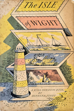
Barbara Jones
1912-1978
Born in Croydon, in her career was was a painter, author, collector and curator. She had a scholarship to Croydon Art School from 1931-33. She then followed on her studies to the Royal College of Art. Specialising in engraving and then mural decoration, graduating in 1937. She produced murals for a wide range of companies and private homes.
In the Festival of Britain in 1951, designing the Coastline of Britain, Seaside section, and the Outside Broadcasting mural for the Television Pavilion, as well as working on the Lion and Unicorn Pavilion and the Battersea Funfair.
She did a design for the Queens Coronation in 1952 but unfortunately they where not selected.

In 1956 she a designed a poster for GPO reminding customers to use correct amount of postage its the first image in the gallery. At the time ’inland’ postcards where a separate type of mail. It’s modern style, doesn’t feel too out of place for something maybe produced much more recently. Its lovely use of tone and colour, it’s playful and I would imagine not easy to forget. The other images are for other projects she created for.
Dorrit Dekk
1917-2014
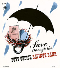
Dorrit Dekk was born Dorothy Fuhrmann in Brno, in today’s Czech Republic. As a Jewish artist, she moved to London in the late 1930s to escape persecution by the Nazis and served as a radio intelligence officer. After the end of the Second World War, Dorrit worked as a government poster designer in the Central Office of Information. Within a few years, she became a freelancer with the professional name ‘Dorrit Dekk’.
She designed commercial posters for the Post Office Savings Bank (POSB), London Transport, P&O and Air France, among other businesses, and she also illustrated for Tatler Magazine and Penguin Books.
If you visited a post office in the swinging 60s, you might have seen this rather bold poster on the wall. It was meant to get you thinking about opening an account with the Post Office Savings Bank. I absolutely love her work and its bold fun nature but also captures a sentiment or a feeling. Using energetic and good natured illustrations it really pulls you in to read and learn more.
Victoria Davidson
1915-1999
Born in Munich, Bavaria, Lilli Ursula Barbara Commichau and work also went under Victoria Davidson. She studied fashion drawing, the Lette-Haus School of Art, Berlin 1930-1933. She worked as a freelancer, illustrator and layout artist.
She was a member of the Society of Industrial Artists. She worked freelance in Germany, her husband was Jewish who left for the UK in 1935, following him they both became UK Citizens. She contributed illustrations to the magazines Picture Post, Liliput and the Radio Times and designed posters for The Postal Service and London Transport.
She produced posters for the Post Office in the 1960’s. Her most famous works was ‘Save yourself annoyance’ and another ‘Have you brought your Christmas gift for posting overseas’ in 1965.
The save yourself the annoyance poster, was to highlight the importance of letterbox size and placement. It’s playful and clear, the typography plays with the illustration beautifully, you read the poster really well in a logical progression, the use of large and small words really keeps you reading. The Christmas gift posting poster, features the owl and the pussycat, who have left it to late to post and now are taking themselves in their pea-green boat. It’s fun, it has bold colourful presence, linking to something people already know and understand too. I’m sure customers and children saw it and sang to themselves the rhyme, I know I did on seeing it.
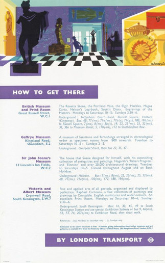
Below are other examples of her work across her career, for London Underground and promoting museums across London.
Carol Barker
1938
Carol born in London, as child was evacuated to New York during WWII. She then returned to Britain and studied in Bournemouth College of Arts, Chelsea Polytechnic and Central Schools of Art and Crafts. In 1958 became a freelance illustrator. In her career, she was seen as a designer, artist and illustrator. She created illustrations for children’s books. She designed stamps, posters for the Post Office and London Transport posters. At the time they where very much at the forefront of poster design and ways to communicate to the public. The poster ‘Children’s London’ was spoken about in 1974 as being one of the best British posters of 1973. It has such a impactful mark making style. So precise but also with fluidity.

Her work for the royal mail was ahead of its time. It has such beautiful mark making and observations, her illustrations have such detail and beautiful use of colour. Each composition perfectly put together for the reader to progress reading it.
The bottom 3 images are from posters she produced for London Underground.
Faith Jaques
1923–1997
Born in leicester. She attended Leicester College of Art from 1941 to 1942. She joined the Women’s Royal Naval Services as soon as she was old enough to leave home. She was posted to Oxford. Her role there looking after filing of millions of photographs and gaining a library of reference materials aswell as excellent organisational skills.
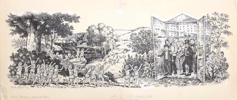
From 1946 to 1948 she attended, the Central School of Arts and Crafts, London. Late 1940s, she began teaching part time, while she was also producing her graphic design work. She originally designed the first illustrations for Roald Dahl's Charlie and the Chocolate Factory in 1973. I honestly got lost in this illustrations. I know they aren't Post Office related but the imagination and beauty of these can't not be shared.
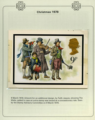
Her work for the Postal Service was between 1960 and 1978. Her designs chosen for the 1960s valentine telegram. Her designs on stamps included: the Tercentenary of Establishment of the General Letter Office in 1960, the Seventh Commonwealth Parliamentary Conference in 1961 and three Christmas Stamps in 1978.
Her work can be super traditional style like the Christmas stamps but also her other work is bold and graphic. Had a real modern style with bold colours and layout. I love the productivity year stamp, you can almost see that on a design now and wouldn’t be out of place.
Rosalind Dease
1928
Born in Jersey in 1928, studied at the Royal College of Art. she worked as a freelance illustrator of books, newspapers and magazines, a typographer, a designer of exhibition stands and fabrics. She worked for the Royal Mail Between 1962 and 1974. She designed a number of stamps for the royal mail both in her own name and with her then-husband, David Gentleman. There was very little online about her all.
1968 Christmas stamps, which feature children playing with toys. Her sketches below show her level of detail in her research and the love she put into her craft. 326,078,360 rocking horse stamps were sold, which gives some idea of the enormous number of stamps produced.
These pages of her sketch book I found, honestly there are no words and the fact they skill exist to see so clearly. The detail she went into for it to be so small on a stamp. You can see her crafting and perfecting each one in a magical way.
Sylvia Goaman
1924 – 2006
A British graphic designer, working in textiles, postage stamps and stained glass window design. She had a long career designing stamps for the Royal Mail. I couldn’t find many details about her life.
Her husband Michael Goamon is known to have taken credit for work she largely designed herself. Who knows how true or not this is. I like to think they worked on it together in a beautiful meeting of creative minds but I also don’t like to think again a women’s talent was hidden behind her husband. She has a large bank of work over all her years though and all absolutely beautiful.
Honouring Their Legacy, Inspiring Our Future
All these women made significant contributions to Royal Mail’s poster and stamp design as well as the larger scope of creative industry. Their works for the postal service blended functionality with artistry with clear effective messaging and strong visuals. As the Royal Mail expanded its use of posters to promote various services, these women played an essential role in shaping how the British public interacted with the postal system.
To these pioneering women, I offer my heartfelt gratitude—not only for the doors you opened and the paths you created but also for the immense passion and determination it undoubtedly required to produce and stand strong in a world that often overlooked your brilliance. You in no doubt have inspired generations of women like me to create, persist, and succeed.
Every report I read, shows different numbers and facts on male of female ratios in creative industry. Who knows what the true numbers are and maybe it doesn’t matter. From experience in the last 14 years, I feel we still have some way to go to equality and equal representation in creative but each persons journey is different.
Women History Month isn’t just another date in the calendar each year, but a chance to inspire the next generation of young women and honour those who came before us.


































Comments